 I keep telling myself, say what you will about me, at least I'm not really a book collector. I realize how laughable that would sound to my husband, or to anyone who might ever have seen the fire-hazard that is my library. I own a lot of books. Not the same thing though, I would insist, as collecting. To begin with, there's very little sense to the way I buy books, let alone a plan. I simply buy what I want to read. That is not the behavior of a true collector, who may or may not ever read the books they collect. Some people collect books for their market value, as an investment -- though it's hardly a wise one, considering the instability of literary reputations, the most infamous example being Galsworthy. Quite a market for Galsworthy first editions at one time, and then there wasn't. But even if one were to collect just what has proven to be rare and consistently valued, the pleasure of books, most books for most readers, is in the reading, and I for one would be terrified to handle anything too valuable as I might my own books, for fear of sneezing into it, or dropping hot chocolate on it, or going to sleep on top of my First Folio Shakespeare one night and waking up the next morning with the ruins under my pillow. While I care for my books and dislike anyone who doesn't, I can not imagine curating my library, or having a library that requires curation, anymore than a liking for flowers is the same thing as raising orchids.
Take Shakespeare then as my first example. To get to my very good if by no means terribly attractive set of the individual Shakespeare plays, just now, I would not only have to squeeze between two very full bookcases, but also climb across a whole collection of Modern Library books and the overflow from the biography case that litters the floor. "It is no act of common passage, but a strain," worth doing I might add, if I want to read Cymbeline, but not if I just want to find that quote (Act III, Scene IV.) Which is why I keep my one volume Oxford edition of The Complete Works of William Shakespeare -- very nice and easier to consult -- right on my desk. Problem solved. This, I will insist, does not make me a collector of Shakespeare, just lazy. So while I own more than one edition of Shakespeare, for reasons I hope I've just explained, I am not interested in collecting Shakespeare in multiple editions. Likewise, while I may own a certain novel by Defoe in a Modern Library edition, and a a little Konemann hardcover, and a lovely old illustrated copy, that isn't the same thing as collecting Defoe. I like the sturdy Modern Library books, in the versions they published with the uniform design and dustjackets until just a few years ago, because the books are handsome as a set, and because they were inexpensive but well made; suited to bus travel and easy to read in even weak light. The now sadly discontinued Konemann classics are equally attractive, and tough, but also small enough to fit in a pocket, and hence best suited to a walkabout. I love legible hardcover books small enough to fit in one's pocket for just that reason. That, and little books are adorable, like small children and dogs. As for the illustrated copy from the 1930s, well, that one was just too pretty, and cheap, not to buy. Illustration and book design have a charm of their own, to which I am not immune. That's the difference, between a dissolute reader and buyer of cheap books like me and a real collector, see? I don't actually own
many valuable books. Couldn't afford to if I wanted to. I may like a particular title or author enough to own more than one book in more than one edition, in different sizes and so on, but I feel no obligation to specialize, nor do I value a book more, in most cases, for being "a first." (The few that I do, like my Beerbohms, I treasure more because there usually wasn't a second edition.) A genuine collector is a specialist, usually, in either a period or an author or a subject. A real collector of modern literature collects, if he or she can afford to, only true, modern firsts. A real collector of Shakespeare, or less grandly of Dickens, or Trollope for that matter, lives for variant and rare editions beyond first printings of first editions; fine bindings, autographed and or presentation copies, books that were owned by other famous writers, variant texts, editions illustrated by various hands. I simply own a lot of books. Perfectly clear, no?
The nearest I come to real collecting, I suppose, is with Dickens. I do own no less than three sets, as well as a few stray volumes. I've reviewed the virtues of these here before. But even with Dickens, I can be tempted still. When I recently reread Hard Times for the first time since I was a kid, I took the stout, if ugly little Oxford with me to lunch, and read the big handsome Nonesuch each night in bed. Before I'd even finished reading that novel though, I saw a rather anonymous brown volume, of The Old Curiosity Shop, another of Dickens' books I'd never reread, saw it in the used bookstore I frequent most often, and opening the book for no good reason, discovered that it contained the truly superior illustrations of Charles Green.

The original illustrations for this book were drawn by Dickens' most frequent collaborator, Hablot Knight Browne, or "Phiz," with the assistance of George Cattermole, who specialized in architecture and interiors, but also drew the characters. Anyone who loves Dickens, must also love Phiz, a name Browne adopted to compliment "Boz," the name Dickens adopted for his early sketches. Theirs was a happy meeting, and a most successful partnership for ten books and the better part of a quarter of a century. Much that one thinks of as being most Dickensian in the books, might just as rightly be described as being Phizical, to coin a word, as the equally detailed drawings are full of sly jokes and brilliant comment on character and setting, not always described in the text; portraits tend to peer or purse their lips, spiders work their webs in the corner of a lawyer's office, the barrels behind the barkeep share his exact proportions, etc. Boz & Phiz parted ways when Dickens did not approve of the work the illustrator did for Dombey & Son. Thereafter, I believe, Dickens hired by the story or the book. None of the work of Dickens' other illustrators, not even that of the great George Cruikshank, fit quite so perfectly into Dickens' books.
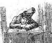
But these pictures by Charles Green, who worked on Chapman and Hall's Gadshill Edition of the works, published in 1898, long after Dickens' death in 1870, are simply beautiful. So beautiful in fact, as reproduced in this inexpensive edition of The Old Curiosity Shop, in America, as part of "The Rittenhouse Classics," that I simply had to spend the eight dollars it cost me to buy the book. Now I'm rereading this book, in this edition, in part at least to appreciate these masterful illustrations. The Mr. Quilp by Phiz that glowers at the top of this, like the Cattermole illustrations throughout the original, shows the perfect little demon as he appears in the text; malevolent, impish, almost animal. The character as drawn by Charles Green, I think, in making him no less violent or ugly, but more recognizably human, does better justice to Dickens' villain, who after all, like Shakespeare's Richard III, may be presumed to reflect in his hatred of the world something of the cruelty occasioned by his deformity. Green's is the more subtle reading, and better for it.
And then there is just the richness of Charles Green's deep black, the grain in the wood, the shadows in the folds, the animation in every scene. Even Nell, remembered as more doll than child by generations of later readers, however beloved by the Victorians, may owe something of her reputation for dumb prettiness to Cattermole's stiff little Miss, whereas by Green's pen she has a full range of expression, just as, rather surprisingly, she does in the text of the novel, which I suspect very few people may have read recently, for fear of of just that sentimental rigidity suspected from the original pictures.
Just to prove that I am not a true collector of Dickens and his illustrators though, I would also mention the Heritage Press editions of Dickens that we've had across the Buying Desk with some regularity. These are handsome big books, all in slipcases, and attractively made according to the standard set by George Macy, the founder of the Press. The idea of The Heritage Press was to offer attractive editions of the classics, with new illustration, at a more affordable price than those produced for his higher end Limited Editions Club. Sadly though, as with many if not most of the books produced by Mr. Macy's enterprise from the nineteen-thirties until their end in the seventies and eighties, the selection of illustrators is often unhappy, and never more so than with the Heritage Dickens.
Little Dorrit, for example, in the Heritage from 1956, was illustrated by Mimi Korach, known now if at all for her work otherwise exclusively on children's books. Her illustrations of Dickens dark later novel are all done in an insipid style, more appropriate to children's picture books, and made even less attractive by the repetition of a sickly pink wash, popular at the time, and the exact color of Beeman's gum.
Better by far are the pictures from the Heritage edition of 1957 of Dombey and Son, by Henry C. Pitz, though again, the insistence on color, in this case some quite muddy greens and browns on nearly every plate, makes the whole rather more murky than needs be. Pitz did better with the black and white spot illustrations, clearly influenced, as are the plates for that matter, by Rackham, but with little or none of that masterful artist's whimsicality or restraint. What's worse, for reasons that must remain inexplicable to any regular reader of Dickens, Pitz chooses to never draw either the most famous scenes in the book, or it's most pictorial characters, including not even one drawing of Captain Edward Cuttle, among the most beloved of Dickens' grand grotesques! Taken as independent of the text, Pitz's work might just as easily fit into a novel by Wharton, or far worse and more likely, by John P. Marquand.
Only the earliest of the Heritage Press Dickens that I've seen, the 1940 Nicholas Nickleby, with illustrations by Steven Spurrier, comes close to the satisfactions of Phiz. Spurrier's "Mr. Mantalini," loosely crosshatched, spotted with pastels, looks the proper entertainer, and Spurrier is even better with the crowded groups in the theater and elsewhere. His drawings are packed with wild activity, loosely and happily drawn, and with a background of wonderfully fast faces, all round and pink, the features often no more than a dot a dash and a line, but quite expressive. Still, much of the individual character of the characters in the more detailed drawings is lost under such a rapid, cartoonish hand.
 What should be the worst of the Heritage books though, when judged just as illustration to Dickens, is done by John Austen. His thin style might best be suited to lighter fair, though one might assume he saw himself drawing for that other Austen rather than Dickens. But John Austen is too slapdash altogether for such perfectly constructed prose as Jane's. That this artist should have been assigned David Copperfield, of all things! Here are some of Dickens best known and most beloved characters as drawn by someone who would seem never to have read a word of the book, given so much as a thought to the costume of the period, or felt the slightest need of anatomy. Take Austen's picture of Betsey Trotwood and Mr. Dick, stiff as tombstones, she in an Empire shift, and he in an indistinctly drawn cutaway, the weirdly penitent little David, out of all proportion, bowed down before them -- and this, as in every scene pictured -- all done in light pastel colors and thin, spidery lines! Worst of all, Wilkins Micawber in unforgivably loose trousers, his dear, round head, and proud, silly, sentimental, face, here reduced to an expressionless newel, a mere nob on a badly dressed dummy! Just awful.
 Finally, what is actually worse in a way, is very bad work from a much more talented artist, Lynd Ward. Recently, the Library of America reprinted in two volumes, to considerable fanfare, the pictorial, wordless novels of this artist. The case was made, in more reviews than one, that with these Ward anticipated what is now known as the "graphic novel" by decades. Those books are startlingly inventive and complex works. All the more reason to be shocked by the complete failure of his illustrations for the one work by Charles Dickens to which Ward's unique gifts might have been thought best suited, Our Mutual Friend. Perhaps the darkest of Dickens' books, other than the unfinished Drood, the opportunity for an artist of Ward's caliber, known for his imaginative use of thick blacks, and startling whites, for grotesque distortions and asymmetries within the frame, working with this material, Ward's illustration might have been exceptional. And yet, the result is more than disappointing. The plates are rigidly framed and badly drawn, rather than intentionally distorted in any way. Like some amateurish imitation of the most monumental, overblown work of Käthe Kollwitz, wholly inappropriate to the text, Ward plants each characterless character like a dock post in a field of motionless green mud. In a novel that moves on water, Ward never shows so much as a trickle of movement. The final effect is to suggest a book so dull as to be dead, when in truth this is true only of the pictures. A Complete failure.
As I've already wandered so far from my point, perhaps I'd better just restate it. I am not a collector. The Heritage Press Dickens, I feel, proves this. At least I don't feel the need to own books with ugly pictures. See?
No comments:
Post a Comment