 I am not much concerned with variant editions, but then, as I've said before, I am not really so much a collector of books as a selfish reader: I want my own of everything, read hardcover in preference to paperback as much now for the print as the bindings, and delude myself that I may someday read and or reread every book I own. I know myself unlikely to live to such a Methuselan dignity, but still, it is a comfort to think that should, by the surprising grace of the Gods, I live so long, I would have plenty, if not to read, then to be read to me. As I am already then in possession of more than my fair share, it seems gross of me to own duplicate texts in different bindings. Yet I of course do. What, three sets of Dickens? Yes, but they're different, each to a separate and considered use; the Nonesuch reprints to date are beautiful, but too big to be carried around, the Oxford is portable, but ugly, my superannuated set... well it's just a handsome old thing and has in it illustrations other than the originals, already represented beautifully in my Nonesuch and badly copied if present in the Oxford. each set therefore constitutes, in my mind anyway, an all but entirely new thing in my library. There, see how easily I did that?
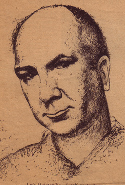
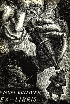
If I own a nice Easton Press edition of Gulliver's Travels, it was really meant to replace my first, an ex-library copy of the Nonesuch Press edition of 1963. I've kept that book though. The high school library from which it was rejected was my own. This book is then, in probable fact, the copy I first read. I bought it at a library sale years later. I've kept it and plan to keep it, for that reason, as well as for the selection of other prose and verse included in this hideously bound, but sturdy and otherwise well made little book. True, I've since bought a broken set of Swift, but the Gulliver is missing, so I don't feel too bad about having two other editions. And then just a few weeks ago, an edition of Swift's novel previously unknown to me came across the desk at the store. I did not buy it from the seller and paid no notice when it sat on the shelf waiting to be priced, but when I came to do just that, I studied it a bit. It is not so rare a thing as to be valuable. What first made me really consider the book was not the handsome jacket or the illustrator's name, unknown to me, but the introduction by Jacques Barzan, I took the book to lunch and read that. It was a charming essay. The appeal of the book grew. When I finally came to study the profuse and arresting illustrations by a 20th Century Spanish artist, Luis Quintanilla, I was not at first much taken with his pictures. The style of the 24 prints and 160 drawings included is detailed, particularly in the large prints, but intentionally unpolished; the cartoons being anatomically loose, intentionally naïf, in a Modernist way I've always found false. And the cross-hatching in the prints likewise had a quick and even carelessly sloppy hurry to it -- at first. As I studied the drawings, I began to see the sense in them, in addition to the more obvious humor. Gulliver's shoes convinced me. They are clumsy, loafish things, weighty looking as the boots of a deep sea diving suit, even in Brobdingnag, they anchor poor, awkward, human, Gulliver in every pose. Gulliver himself is a maladroit figure, bent stiffly this way and that, adapting to figures that alternately march between his legs or poke at him with redwood fingers. He gives over all but entirely to the strange peoples of the later chapters, when the satire shifts and caricatures riot. Among the Houyhnhnms, and home, the assumed dignity of his big square figure and face are softened; he is older, chastened, his face lined with experience, his costume soft patches.

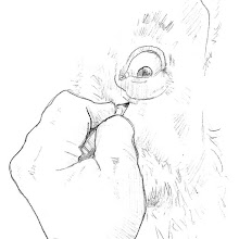
Among the artist's most inspired drawings are his Yahoos, whose feral, fury, toothy, energy is made very vulgarly funny, as it in fact is in the text, but not at the expense of their real menace. Quintanilla's Yahoos, exactly as Swift's, bite.
But the prints are what made me buy the book. The animation I first mistook for hasty draftsmanship crowds each frame with a richly shadowed detail and activity; faces loom up, black eyes arresting the viewer's attention as it is drawn 'round and 'round the picture by the impact of a bladder, the elbow of the physician shot up to a sharp point at the top of the picture, this mouth gapes, that smiles with exquisitely voluptuous lips, every gnarled knuckle of the two contesting old Struldbruggs suggests pain. In even the most beautiful of the large images, there is never less than the quality of a barely arrested dream, always a dark suggestion of bedlam suspended.
Luis Quintanilla, I've since learned, was a remarkable figure: painter, Cubist, patriot, masterful print maker, memoirist, an artist devoted to the beauties and complexities of the human face and form, and the humanity expressed best in both. Remarkable stuff I might otherwise never have seen, had I not needed my third copy of Gulliver's Travels. I would encourage you to follow the link I've put to his name above to an online gallery I've been exploring this evening.
Perhaps needless to say, I bought the book.
Thanks for the good write up.
ReplyDeleteIf my father were better known perhaps it would have taken less time to become acquainted with his intent. A new artist is almost always hard to first grasp. The lines are unfamiliar to us, may appear awkward or unbalanced somehow. And the obvious - until then not seen - may take a moment to properly focus in our mind's eye. But once focused, what a joy the revelation may be! How obvious! How exact and true!
As you can see, I am a fan of my father's work. And, as Ernest Hemingway once claimed, merely being his "pal," I may actually be "prejudiced." And surely the prejudices of a son far outweigh those of a pal.
My father often adopted to his theme, and in his Gulliver he caught, I think, the proper spirit of Swift's satire. Bringing his own art to the other's without detracting or blurring his intent.
Thanks again,
Paul Quintanilla
For more go to: www.lqart.org
Thank you, Mr. Quintanilla! An honor to have your comments added here. As to the "prejudice" of a son for his father, yours is fully justified by more than filial loyalty. A great artist ought to always have had so good a son.
ReplyDelete